The browser war
28 Mar 2024The war of the century
The browser war of the century, Edge vs Chrome, is ongoing. Both companies are desperate for users to make their products their own browser, with both going massive extents to gain an edge (get it?) over each other. In fact, Microsoft has come under fire for injecting code into its systems that detects when the user is doing anything “chrome-related.” For example, when using Edge to go to the Chrome official website to download Chrome, Edge puts a popup on the screen recommending you use Edge instead of Chrome. Similarly, when switching your default browser to Chrome, Microsoft seems to beg you to not move over to Chrome with another popup.
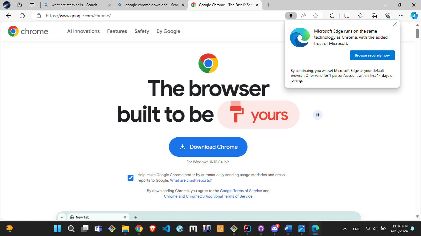
Take a look at the popup on the top right!
Edge vs Chrome
What do browser wars have to do with design patterns!? In my opinion, the UI of Chrome is miles better than the UI of Edge. I’m not saying that the UI difference is a major contributor to Chrome users’ reluctance to switch to Edge; however, I think it is definitely worth noting. The crowded, and at times, overwhelming UI of Edge just simply can’t compete with the clean, sleek UI of Chrome. For example, one can see the contrast between their search engines.
Edge
Looking up “what are stem cells” on Edge throws a bunch of information at once. It’s great, but one can easily feel very overwhelmed. There are buttons and underlines (signaling followable links) all over the page, with image / caption combinations showing up at inconsistent places and flooding the page. Worse yet, there is not a lot of whitespaces between text, giving the impression that the UI is crammed and difficult to navigate. There can be a better way to present all of this information (to reiterate, all this information is not a bad thing) via togglable panels that are hidden by default. Or, there can be very bold headers that section off the page into smaller sections (e.g. history, treatment, experts’ opinion, etc…). Design is subjective, but right now it seems like a poorly done PowerPoint presentation with no organization of information.
Chrome
On the other hand, Google’s search gives us a very straightforward UI, with a single column containing all the results with very generous whitespace and padding, giving the page room to breathe. While information that is presented is limited compared to Edge, sometimes it is better this way, especially as all the information presented on Edge’s search page can be easily accessed with a single click on a link. The UI also has a directing effect to it, where the user knows where to get the information since all their attention is drawn onto the central column; there are minimal elements on the sides to distract them.
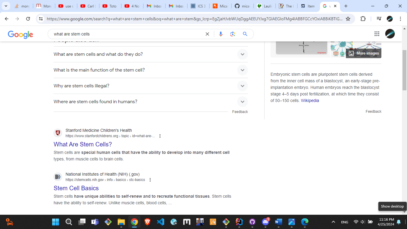
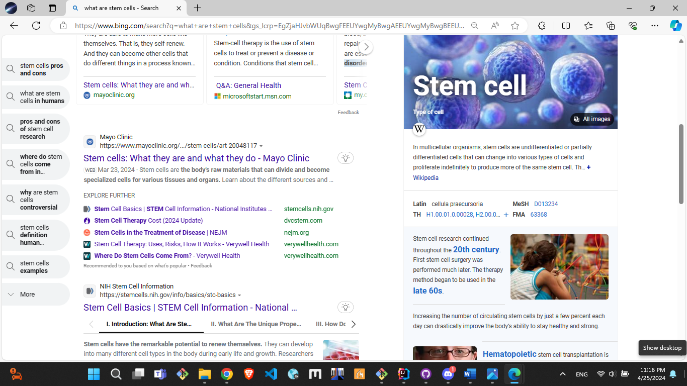
Chrome search (left) vs Bing search (right).
What are design patterns, then?
The difference between Chrome and Edge’s UI highlight a significant difference in their design patterns. Although there is no concrete definition for it, there seem to be a few rules to follow when dealing with design patterns, such as:
- No colors that have bad contrast.
- No distracting / crowded fonts.
- Keep the font size reasonably big.
- Create bold headers to section off pages so the user knows exactly what they’re looking at (can even add some CSS styling around headers to give it more of an isolating effect.)
- Keep the whitespace to a maximum without losing out on quantity.
- Don’t make the user attempt to navigate through multiple panels at the same time (i.e. the user should not have to “search” for an important button).
- Highlight important information!!!
This is not restricted to just web development, but can be applied anywhere as well, such as PowerPoint, Instagram reels, and other graphic designing tools.
My experience with design patterns
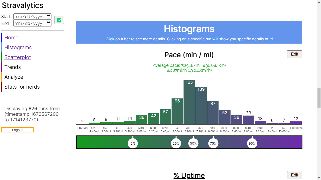
When I design my website, I typically try to follow those design patterns I mentioned above. As a result, a lot of my previous websites have a lot of similar effects. For example, Stravalytics, my newest web application, has blocky colored headers to section off the page. See the image below. The screenshot also has generous whitespace, and it’s clear what the user should be focusing on.
I find it very interesting that these skills naturally carry over to other digital media. For example, I tend to create posters with good contrast with background images lightened / darkened to an extent that the text pops up. Another example is during my PowerPoint slides; I try to vary the font size by a lot so that all the important information is highlighted and the extra information is just there, optionally. These are all simple design patterns to implement; however they can be used to create beautiful digital media, including UIs and websites.